

FREELANCE
VCM

Déjà-vu

E’s Custom
Client
Logo
-
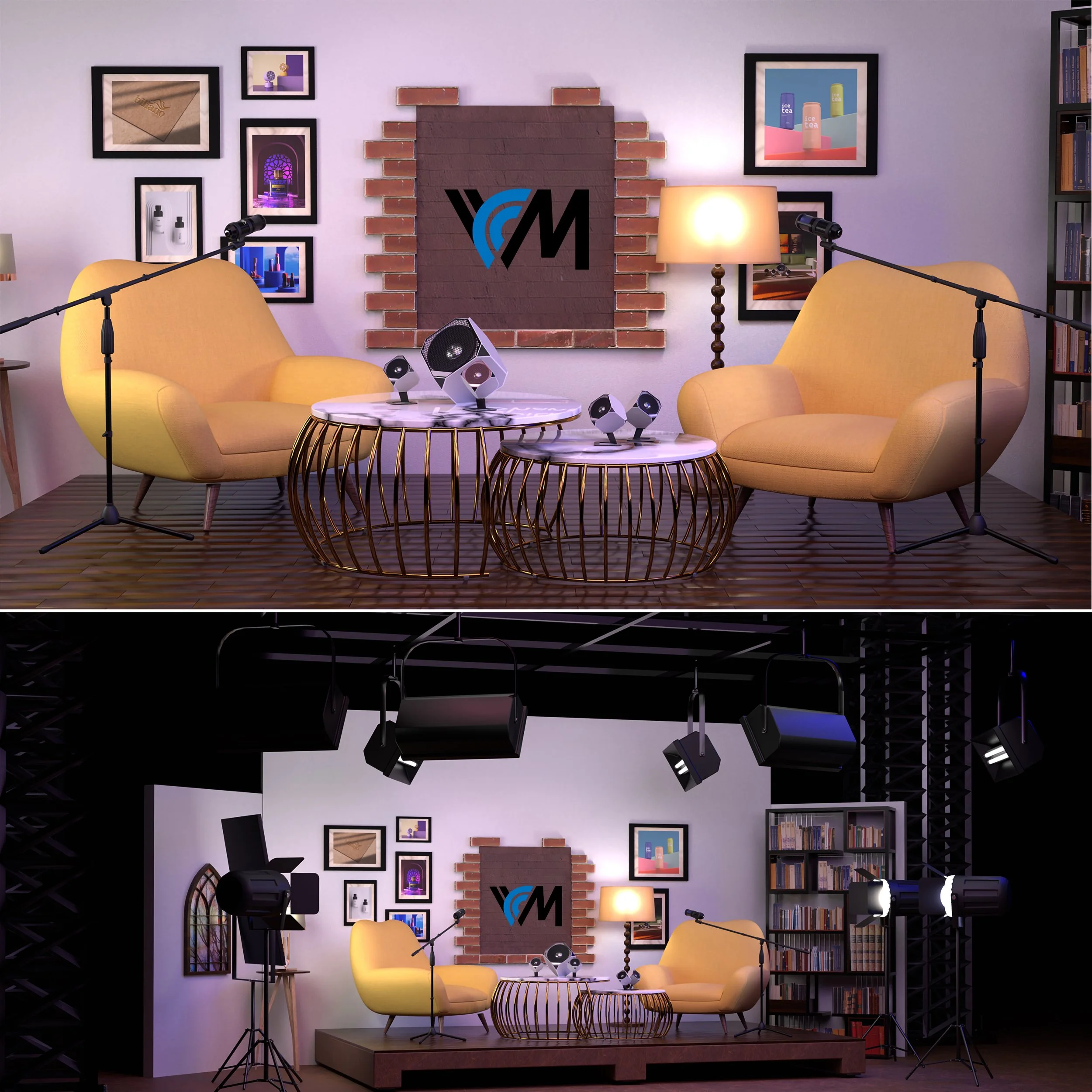
May 2025 / San Francisco, CA
VCM amplifies the voices of students in diverse creative fields—offering a fresh, collaborative space where artists, interviewers, and listeners all connect through conversation and story.
Logo Concept & Meaning
・V & C: The "C" (Creative) emerges from the "V" (Voice)—symbolizing ideas spoken aloud
・M: The "M" visually connects with the "C", forming the phrase Creative Mind
・The Bridge: The curved "C" acts like a bridge between a normal mind and a creative one. It invites the audience to cross over—by listening, learning, and expressing
Colors
・Blue: Calm, trustworthy, open. It reflects the peaceful yet powerful energy of creativity
・Black: Bold and grounded—a stable canvas for creative expression
It’s minimal. But it speaks. Just like the creatives we showcase.
VCM Moodboard Overview
Color Scheme
・Warm Yellow – Inviting, creative (Accent chairs)
・Charcoal & Black – Professional, modern (Mics, lighting)
・Brick & Wood Tones – Authentic, grounded (Backdrop, floors)
・Cream White – Neutral, clean background
・VCM Logo (Teal, Blue, Black) – Bold identity, creative energyFurniture & Set Design
・Mid-Century Yellow Chairs – Cozy, conversation-friendly
・Dual Wireframe Coffee Tables – Artistic, modern
・Bookshelves + Decor – Intellectual, lived-in studio vibe
・Classic Floor Lamp – Warm lighting, casual toneInterior Elements
・Brick-Frame Logo Wall – Industrial + handcrafted
・Framed Art Gallery Wall – Personal, expressive
・Professional Lighting Rig – High production value
・Raised Wooden Platform – Defined stage presence -
May 2024 / Fukuoka, Japan
Client Request
Déjà-vu is a dynamic venue offering nightly live music, rehearsal studios, and music lessons—all under one roof. While the original logo held sentimental value for longtime visitors, it no longer reflected the full scope of what Déjà-vu had become. The owner wanted to preserve the spirit of the existing wordmark but bring new clarity and intention to the design—making it accessible and appealing to new audiences who might not yet know the venue offers much more than just live shows.
Creative Approach
The challenge was balancing legacy with clarity. I began by analyzing how the logo could carry more meaning without losing its identity. Keeping the original typeface as the base, I corrected alignment issues and unified the rhythm between letters. To represent the layered experience of Déjà-vu—restaurant, rehearsal, and education—I added a subtitle that spells out these three functions directly beneath the main wordmark.
To express the idea of connection through music, I made every letter in “Déjà-vu” physically touch, forming a continuous shape that echoes the communal atmosphere of the space. The visual weight of “vu” was shifted beneath the “a” to give the logo a forward-leaning motion, while the Japanese katakana was repositioned more cohesively to maintain cultural nuance.
Outcome
The final design is a modernized homage to Déjà-vu’s roots. It honors its reputation among existing fans while making the venue’s broader offerings more intuitive to newcomers. The new logo serves as a visual anchor for a place where different generations, genres, and journeys meet—whether on stage, in a studio, or during a lesson. Since its implementation, it has been used across signage, menus, lesson flyers, and social media with positive feedback from both customers and staff.
-
February 2025 / San Francisco, CA
Client Request
E’s Customs approached me with a request to design a new logo specifically for their apparel line. While they already had an existing logo, they wanted a fresh graphic suitable for printing on t-shirts and hoodies. The client envisioned a design that incorporated themes of yin and yang and nature, combined with a bold and original typeface for the letter “E” to represent their brand.
Creative Approach
To meet their expectations, I designed two versions: one that closely reflected the client’s vision, and another based on my own interpretation of what would be the strongest direction for the brand. I believe in not just visualizing what the client describes, but also offering alternative solutions that align with their identity and goals.
The yin-yang concept was expressed through a stylized tree trunk, tapering into sharp curves, with a brushstroke texture inspired by traditional Japanese calligraphy. For the custom “E,” I created an original typeface that merges speed and presence—two values central to E’s Customs. I incorporated a star into the letterform to further emphasize the brand’s bold and dynamic character.
Outcome
The final design featured the graphic boldly placed on the back of the apparel, with “E’s Customs” printed at the center of the chest. The client was highly satisfied and went on to produce 50 hoodies with the design—all of which sold out immediately after release.